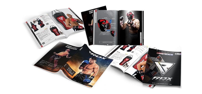
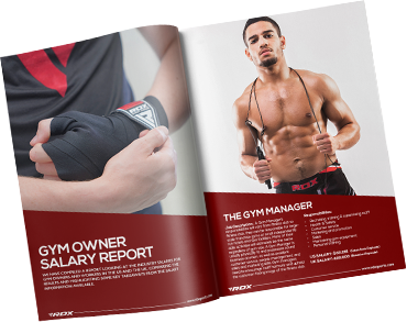
Don’t let anybody fool you with all this talk of a digital takeover; brochures still reign supreme in the B2B sales world.
It simply isn’t possible to fit everything on a single website unless you have a very limited number of products, and even then most distributors and retailers will prefer having a separate catalogue simply because it’s easier to browse through.
The problem, however, is diversifying yourself from the competition. Consumers get brochures thrown their way wherever they go, and research has shown that more than half of these are discarded without even a second look.
So how do you design one that not only stands out from the crowd; it also reels in customers? Here are 5 expert tips:
1. Define Your Objective

Your brochure will never be effective if you don’t know why you’re creating one.
Of course, the basic purpose is to give consumers a digital or printed book that contains details about your products, but the design will change depending on your objective.
For example, ask yourself if you’re designing the brochure for a charity event or as an advertising tool? Do you plan on giving your prices within the catalogue or are you holding back on information to pique consumer’s curiosity?
All of these little details matter because your catalogue, first and foremost, is a medium of communication with your audience. If this will be first interaction they have with your business, they’ll develop an image of your brand based solely on how well that brochure is designed and what it contains.
To ensure you’re giving the right message to your audience, have a meeting with your management and come to a mutual agreement about what content you want to show and how it’s going to be displayed.
2. Understand Your Audience

In addition to your own brand’s image and objectives, it’s important to understand how your audience thinks so that you can design content they’d take a genuine interest in.
For example, if your business deals largely with food-related items and you’re trying to target foodies, the brochure must be themed to reflect that as well.
Designing for a general audience might work in some cases, but standard designs tend to get tossed in the bin more than they’re read.
If you don’t know what your audience is looking for, it’s always a good idea to talk to your salespeople. They deal with customers on daily basis and so understand their psyche better than anyone.
3. Choose Your Fonts Wisely
We can understand the fascination with using multiple fonts to create a unique appeal, but avoid doing this practice as much as possible.
There’s a very fine line between creating something unique and choosing fonts that appear gaudy. In fact, most people don’t realize how easy is it for them to seem unprofessional by choosing inappropriate fonts.
For this purpose, use no more than three fonts; one for the headings, one for the standard text, and one for any special text you want to highlight.
It’s also a good idea to talk to your marketing team. They can rightly guide you about the best fonts that can be used on the material you intend to design (in this case, a brochure).
4. Try Unique Styles
Creativity in brochure design isn’t just limited to using different fonts or adding unique graphics. There are a lot of ways to experiment.
For example, construction or architectural companies add pop-ups resembling some of their more prominent building designs. Leather companies can provide samples of their products directly embedded into the catalogue itself, or have the text printed on leather sheets.
The opportunities are practically unlimited. It’s all about coming up with a good idea and executing it properly.
The greatest benefit of trying something different is that you leave a lasting impression on customers, who’ll have a new found respect for your business. Brand Identity enhanced through creativity is going to do more good for your brand than sales pitches can ever do so.
5. Skip The Details
Here’s something a lot of you might not realise but desperately need to understand: Customers don’t care about your accomplishments. They don’t care about your achievements or the success you’ve managed to achieve in a short period of time.
The only thing customers care about is what you can do for them and how your products/services address their needs.
This is why your brochure needs to be as concise as possible. Skip all the unnecessary details and be to-the-point in your content. Too much information just overwhelms customers and ruins the purpose of the brochure.
A good way to ensure this is by following the simple truth: You’re designing a brochure, not a book. Keep it short and you’ll likely do well.
Related Articles:
5 Tips On Nailing That First Meeting With A Client


